Kinship Rebrand
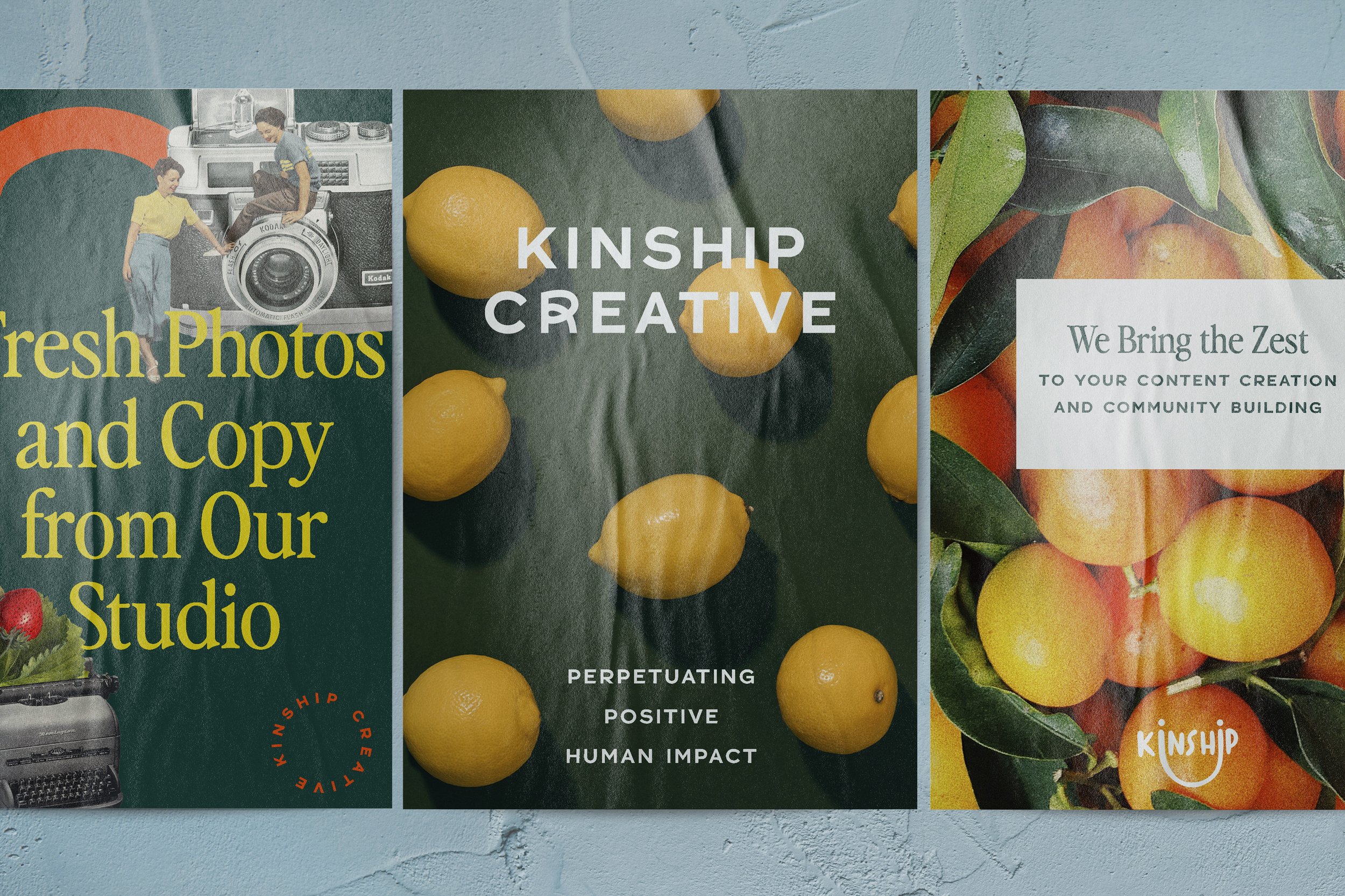
Hey hey, I’m Zoe Cope, Kinship’s Associate Creative Director and I led the visual strategy and brand design for this zesty project.
After 6 years of building brands with our clients, we took the time to shine the light on ourselves and roll out a new agency brand that brings to life everything we love about what we do, who we are, and who we work with. I wanted to introduce a juicier, more lively look and feel, and one that can adapt to a variety of use cases (after all, we aren’t a one-course kind of agency).
At Kinship, we build and support natural food and beverage brands that are doing their part for people and the planet. We value working with clients who trust us, our vision, and our expertise, so I wanted our branding to be connective, confident, dapper, and the perfect mix of playful and polished. We introduced multiple design motifs for logos and taglines, allowing the branding to be agile and work for us in a variety of formats that weren’t possible before.
Curating the Kinship World: The Coolest Lil’ Coffee Shop
As part of my process, I like to create a concept story to build the world from which to create. It exists so that I can immerse myself in a creative habitat, and design from a place of true imagination and evocative emotion.
For Kinship, I felt that working with us is akin to experiencing the comfortability and confidence of having a beloved local coffee shop- it’s comforting because it’s reliable and has staff members you treasure and you’re confident that you’ll always receive what you need from them.
The space itself is beautifully designed and you feel hip getting to do your work there—you’re a part of the scene. The modern aesthetic is met with quirky retro details that put a smile on your face, so much so that you love sharing about this place to friends IRL as well as your social media followers because you genuinely enjoy your time there and what you glean from the experience.
The overall atmosphere is welcoming and connective. It’s full of fun, smart employees who remember what you love but also provide their expert opinion on other beverages or baked treats you’d really like. You trust them and pay them to give you something new - which, it turns out, is your new favorite!
Visual Direction: Contemporary Retro
So, how does this story move into a visual identity? We curated a visual moodboard to set the table, showcasing key elements that influenced our final look:
Mixing of Serif + Sans-Serif Fonts
Logo Suite Exploration
Retro Delight
Playful Illustrations
Exciting and Approachable Color Story
Now Serving: *Kinship Creative
*new look, same great ingredients
Trusted professionalism meets playful creativity to create an aesthetic that is both contemporary and retro


Our new look features design and font motifs from both the 50s and 90s, because no matter where trends move on from 2022, the classics will always be stylish.
Fun design details like illustrated squiggles and handmade collages made from vintage photos help bring moments of delight to the branding.
A calming, neutral foundation supports the more vibrant colors that are present in portfolio photography, design details, and logo variations.
retro delight
Maria Scott, our amazing in-house Graphic Designer, and I worked on bringing these designs, collages, and illustrative elements to life. We honed our color palette to include a mix of retro Americana hues, colors with contemporary pizazz, and classic neutrals. All brand colors continue to be inspired by nature, but now feature richer tones than the palette of Kinship’s past.
custom illustrations
With the palette in place and our art direction secure, we enlisted Oregon-based artist Dorothy Siemens to create custom employee portraits. We aimed to strike a balance of abstract and detailed elements in the illustrations so that they told a visual story independently as well as collectively, and Dorothy delivered in spades. We provided quippy, fun bios and a slew of photos of our team and she was able to distill them down to the aspects that make each of us, us.
breaking the internet


No rebrand would be complete without a website overhaul. We worked with copywriter Lindsey Steinberg to bring the Kinship voice and tone to life on our website. To best speak to current and potential clients, we wanted our voice to be knowledgeable, authentic, connective, trusted, and playful (and to include puns, because they’re the zest!). Lindsey found an amazing way to share our philosophy and put our most authentic messaging out into the world.
To showcase all of our brand development work from our look to our business practices, Maya Normandi worked her magic with our website development. The components of moveable collages, rotating text, hover effects, wavy marquees, and so many other custom goodies created a delightful environment for our online presence.
It’s Kind of a Big Dill
As with any rebrand, it’s not just surface stuff. Whether it’s our clients or our own brand building, we dig deep to uncover authentic stories across all of our work. Our fresh look is the outward expression of everything we do—how we function as a company, the services that light us up, and the way in which we care for our community, each other, and our clients. Thanks for joining us on this journey – here’s to another 6 years and beyond!


